
Data Exploration and Visualization on Bean Market Data
Data Exploration
I wanted to take a break this week from Machine Learning and prediction algorithms on the bean data and do a bit of data exploration and visualization of what is a pretty rich data set. The idea here is a bit of a conceptual switch from what we’ve been exploring - here, I’m interested in picking apart trends in the market, and examining relationships between the variables.
First, let’s import the data from github and get the appropriate packages loaded:
#packages
library(tidyverse)


#importing the master data set we've been working with
bean_master_import = read_csv(file = "https://raw.githubusercontent.com/keatonwilson/beans/master/data/bean_master_joined.csv?token=AefUVJns3Rn5W9UiDzbkOhHnKJFGyqHNks5bq6oTwA%3D%3D")

glimpse(bean_master_import)
## Observations: 8,407
## Variables: 19
## $ date <date> 1987-01-13, 1987-01-21, 1987-01-27, 1...
## $ class <chr> "Pinto", "Pinto", "Pinto", "Pinto", "P...
## $ price <dbl> 18.62, 18.25, 18.12, 18.12, 18.49, 18....
## $ weekly_avg_price <dbl> 18.62, 18.25, 18.12, 18.12, 18.49, 18....
## $ future_date <date> 1987-07-13, 1987-07-21, 1987-07-27, 1...
## $ future_weekly_avg_price <dbl> 20.25, 20.25, 20.00, 19.25, 18.75, 18....
## $ whole_market_avg <dbl> 29.18700, 28.85000, 28.89900, 28.81200...
## $ whole_market_sum <dbl> 291.87, 288.50, 288.99, 288.12, 239.99...
## $ class_market_share <dbl> 0.06379553, 0.06325823, 0.06270113, 0....
## $ planted <dbl> 637.6, 637.6, 637.6, 637.6, 637.6, 637...
## $ harvested <dbl> 617.1, 617.1, 617.1, 617.1, 617.1, 617...
## $ yield <int> 1549, 1549, 1549, 1549, 1549, 1549, 15...
## $ production <int> 9560, 9560, 9560, 9560, 9560, 9560, 95...
## $ season_avg_price <dbl> NA, NA, NA, NA, NA, NA, NA, NA, NA, NA...
## $ production_value <int> NA, NA, NA, NA, NA, NA, NA, NA, NA, NA...
## $ year <dbl> 1987, 1987, 1987, 1987, 1987, 1987, 19...
## $ month <chr> "January", "January", "January", "Febr...
## $ imports <chr> NA, NA, NA, NA, NA, NA, NA, NA, NA, NA...
## $ season_total <chr> NA, NA, NA, NA, NA, NA, NA, NA, NA, NA...Lots of variables here, so take a brief moment to re-orient to all the data we have at our disposal.
Basic Visualization
So, the first thing that would be nice to see is how price of each class (bean type) has changed over time. Because we have lots of classes, it makes sense to facet our data (split it by class). This is easy in ggplot2.
ggplot(bean_master_import, aes(x = date, y = price, color = factor(class))) +
  geom_path() +
  facet_wrap(~ class) +
  ylab("Price/Hundredweight ($)") +
  xlab("Date") +
  scale_color_discrete(name = "Class") +
  theme_classic() +
  theme(axis.text.x = element_text(angle = 60, hjust = 1))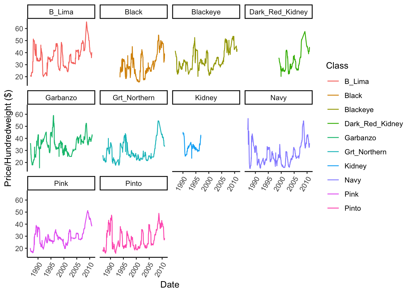
This is cool - we can see that not all prices have been tracked for all classes across time, and we can see how much variance across time there has been - for example Navy beans were SUPER expensive in the early 80s, but dropped noticeably through the 90s and early 2000s. There also seems to be some interesting periodicity in Pintos, where prices spike every 9 years or so.
We can also plot the overall market average price and determine which classes are over- or under-performing relative to the entire market. The dotted line is the market average and the solid line are individual class prices.
ggplot(bean_master_import, aes(x = date, y = price, color = factor(class))) +
  geom_path() +
  geom_path(aes(x = date, y = whole_market_avg), linetype = "dashed") +
  facet_wrap(~ class) +
  ylab("Price/Hundredweight ($)") +
  xlab("Date") +
  scale_color_discrete(name = "Class") +
  theme_classic() +
  theme(axis.text.x = element_text(angle = 60, hjust = 1))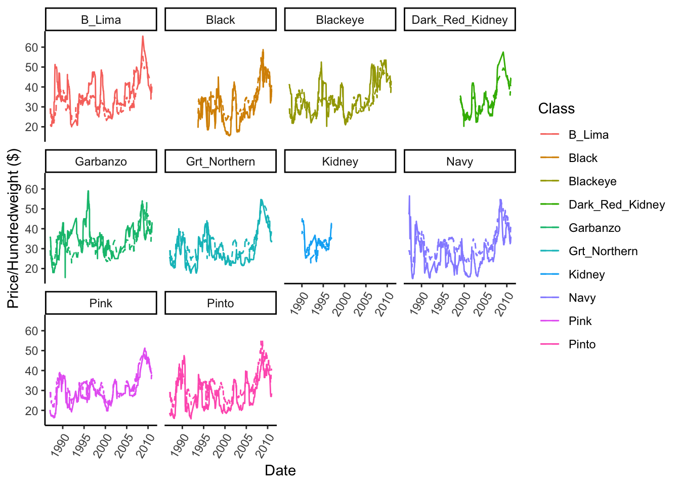
This is a little hard to see with this much data, so let’s zoom in on Pintos. I’ll use the pipe operator and dplyr’s filter function to subset…
bean_master_import %>%
  filter(class == "Pinto") %>%
ggplot(aes(x = date, y = price)) +
  geom_path() +
  geom_path(aes(x = date, y = whole_market_avg), linetype = "dashed") +
  ylab("Price/Hundredweight ($)") +
  xlab("Date") +
  theme_classic()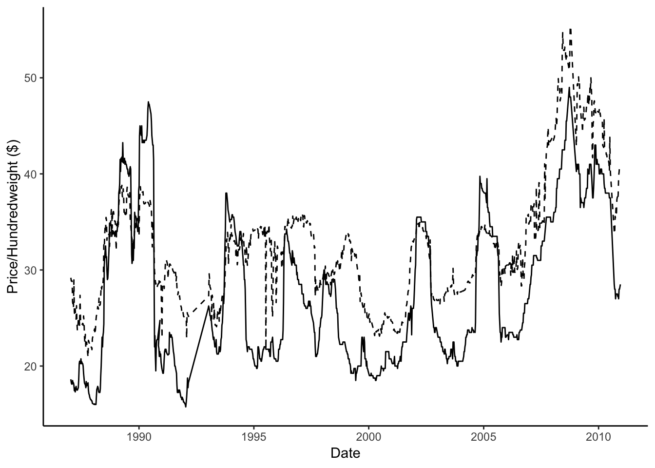
This information can also be presented easily in a table - using a bit of the tidyverse’s summarizing magic. Here, I use mutate to generate a new column that looks at each row and determines whether a price datum is above or below the market average. We can then summarize this across all data and get the percentage of time a given varietal is above or below the market average.
bean_master_import %>%
  mutate(above_avg = ifelse(price > whole_market_avg, 1, 0))  %>%
  group_by(class) %>%
  summarize(percent_above_market = sum(above_avg)/n()) %>%
  arrange(desc(percent_above_market))
## # A tibble: 10 x 2
## class percent_above_market
## <chr> <dbl>
## 1 B_Lima 0.725
## 2 Dark_Red_Kidney 0.647
## 3 Garbanzo 0.567
## 4 Blackeye 0.534
## 5 Kidney 0.5
## 6 Black 0.254
## 7 Pink 0.197
## 8 Grt_Northern 0.177
## 9 Pinto 0.167
## 10 Navy 0.0617Interesting! It looks like Baby limas dominate the market overall, in our dataset, they are above the market-average 72.5% of the time, while Navy beans (even though being really high in 80s) were only above the market average 6% of the time since 1981.
One last interesting data visualization we could do would be to plot market-share of individual varietals over time. Again, easy-peasy with ggplot2.
ggplot(bean_master_import, aes(x = date, y = class_market_share, color = factor(class))) +
  geom_path() +
  xlab("Date") +
  ylab("Percentage Market Share (%)") +
  scale_color_discrete(name = "Class") +
  theme_classic()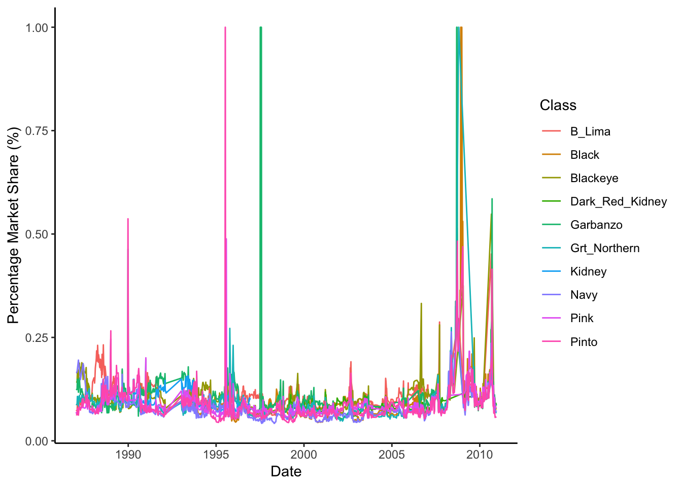
Ok, so this figure doesn’t make a lot of sense - why are there huge spikes for some varietals? It’s probably because we have some missing data, so a given percentage marketshare for a given date isn’t representative (i.e. imagine a date that we only had information about pinto price - it would be 100% of the marketshare, but this isn’t real).
How do we try and fix this?
Let’s subset our data, and cut off all data that is above 35%, under the assumption that a given varietal probably never occupies more than 35% of the market share (there are 10 varietals… this is probably a good assumption.)
bean_master_import %>%
filter(class_market_share < 0.35) %>%
ggplot(aes(x = date, y = class_market_share, color = factor(class))) +
geom_path() +
xlab("Date") +
ylab("Percentage Market Share (%)") +
scale_color_discrete(name = "Class") +
theme_classic()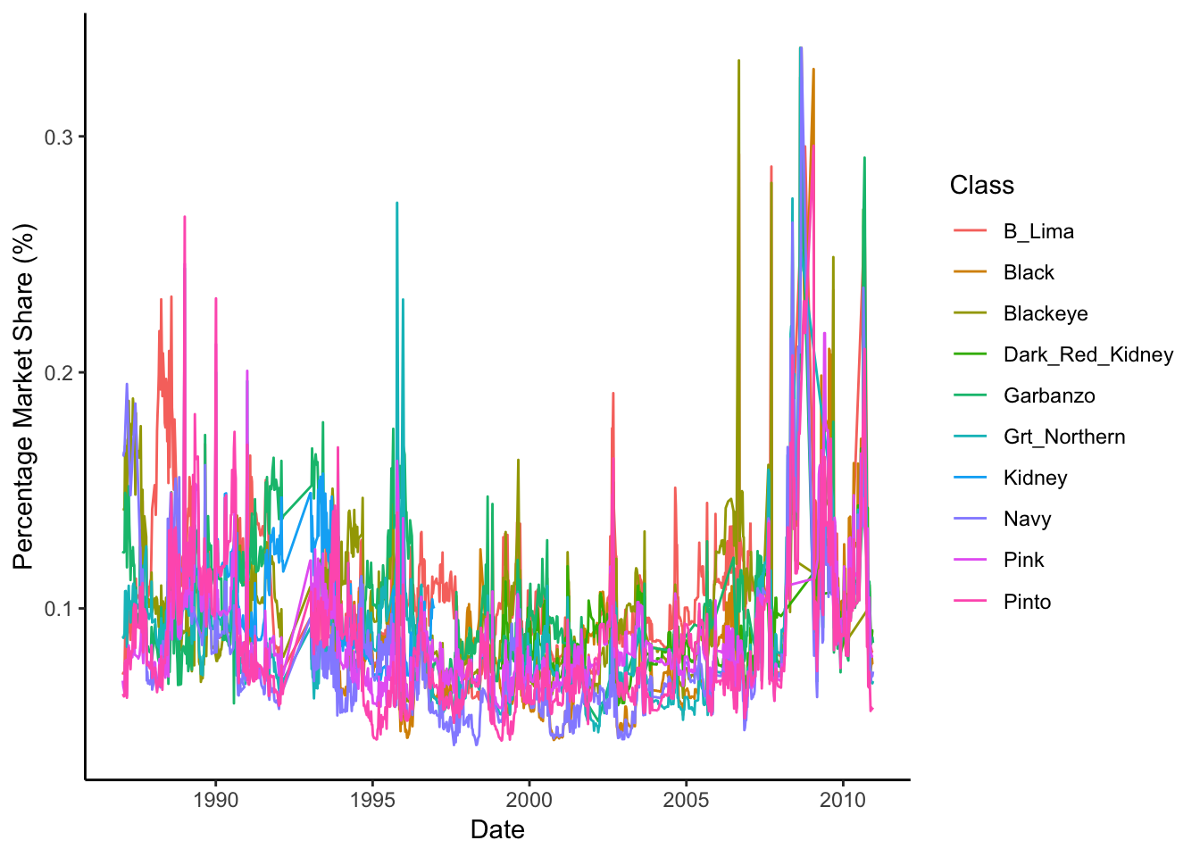 Still hard to obtain any useful information here, let’s try and do a bit of smoothing…Here, I’m using the default loess smoothing method, and have turned off the confidence-interval plotting.
bean_master_import %>%
  filter(class_market_share < 0.35) %>%
ggplot(aes(x = date, y = class_market_share, color = factor(class))) +
  geom_smooth(span = 0.8, se = FALSE) +
  xlab("Date") +
  ylab("Percentage Market Share (%)") +
  scale_color_discrete(name = "Class") +
  theme_classic()
## `geom_smooth()` using method = 'gam' and formula 'y ~ s(x, bs = "cs")'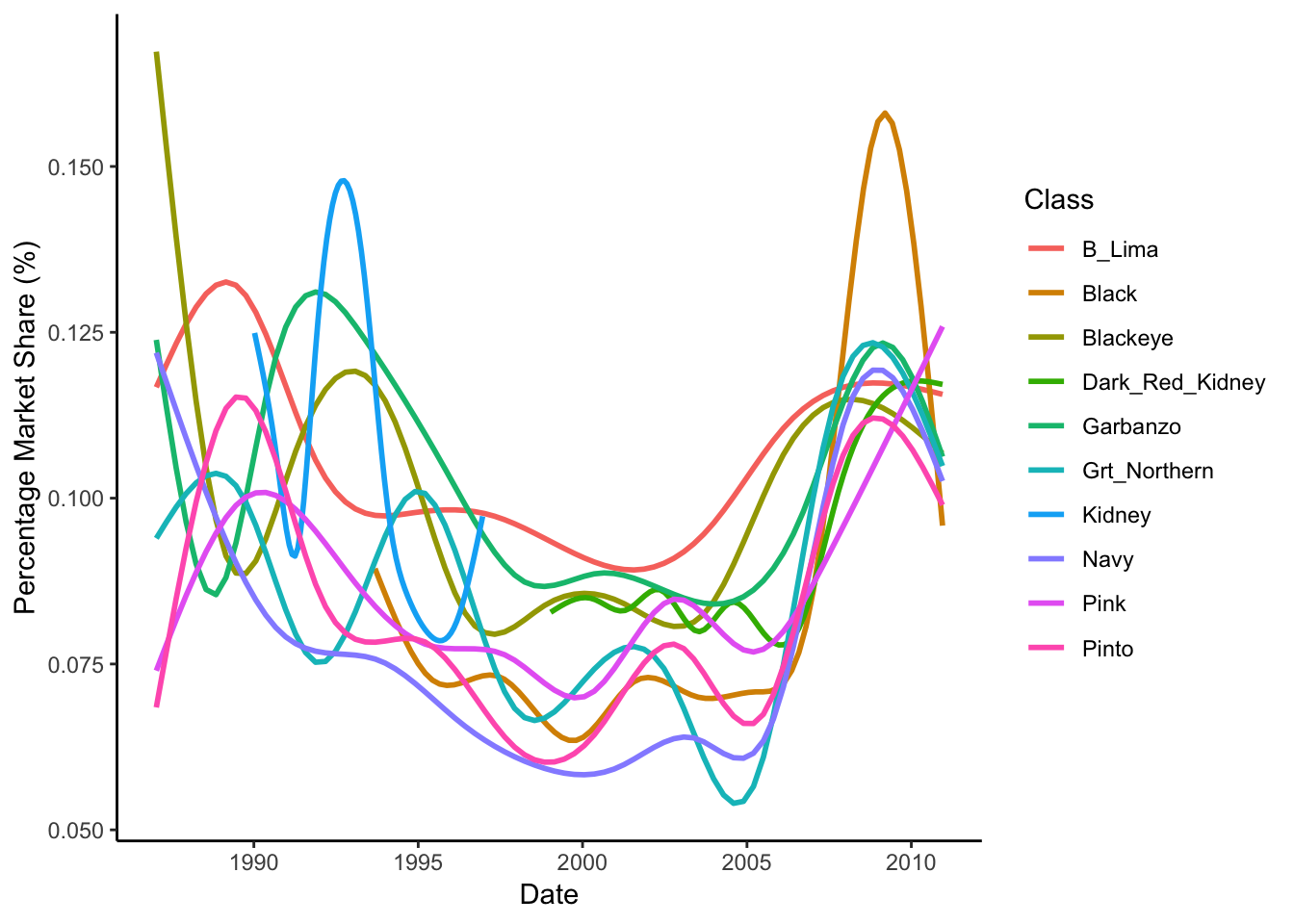
We can see that a lot has changed since the 80s. 2010 has varietals that more equally contribute to the market compared to historic valuees. Navy beans seem to be on the rise - with a steady increase in marketshare since 2000.
Correlations between varietal (class) prices
One other interesting question we might ask is if the prices of different varietals are correlated with each other? In other words, is the price of black beans typically high when pintos are high, or do garbanzo bean prices drop when baby limas are high? These types of interactions might be the result of a variety of factors including demand, and competition for growing acreage.
To look at these interactions, we need an ally: specifically the GGally package, which let’s us build really beautiful scatterplot matrices using ggplot framework. It’s also worth mentioning why the code below is a bit more substantial than what we’ve used so far - to generate these types of plots, we have to change our data from long form to wide form… because we’re treating the prices of different classes as separate variables. Again, the tidyverse’s gather and spread functions to the rescue.
library(GGally)##
## Attaching package: 'GGally'## The following object is masked from 'package:dplyr':
##
## nasabean_master_import %>%
select(price, class, date) %>%
mutate(class = factor(class),
id = 1:n()) %>%
spread(key = class, value = price, drop = TRUE) %>%
group_by(date) %>%
summarize(B_Lima = mean(B_Lima, na.rm = TRUE),
Black = mean(Black, na.rm = TRUE),
Blackeye = mean(Blackeye, na.rm = TRUE),
Dark_Red_Kidney = mean(Dark_Red_Kidney, na.rm = TRUE),
Garbanzo = mean(Garbanzo, na.rm = TRUE),
Grt_Northern = mean(Grt_Northern, na.rm = TRUE),
Navy = mean(Navy, na.rm = TRUE),
Pink = mean(Pink, na.rm = TRUE),
Pinto = mean(Pinto, na.rm = TRUE)) %>%
select(-date) %>%
ggpairs(lower = list(continuous = wrap("points", alpha = 0.3, size=0.1),
combo = wrap("dot", alpha = 0.4, size=0.2) ))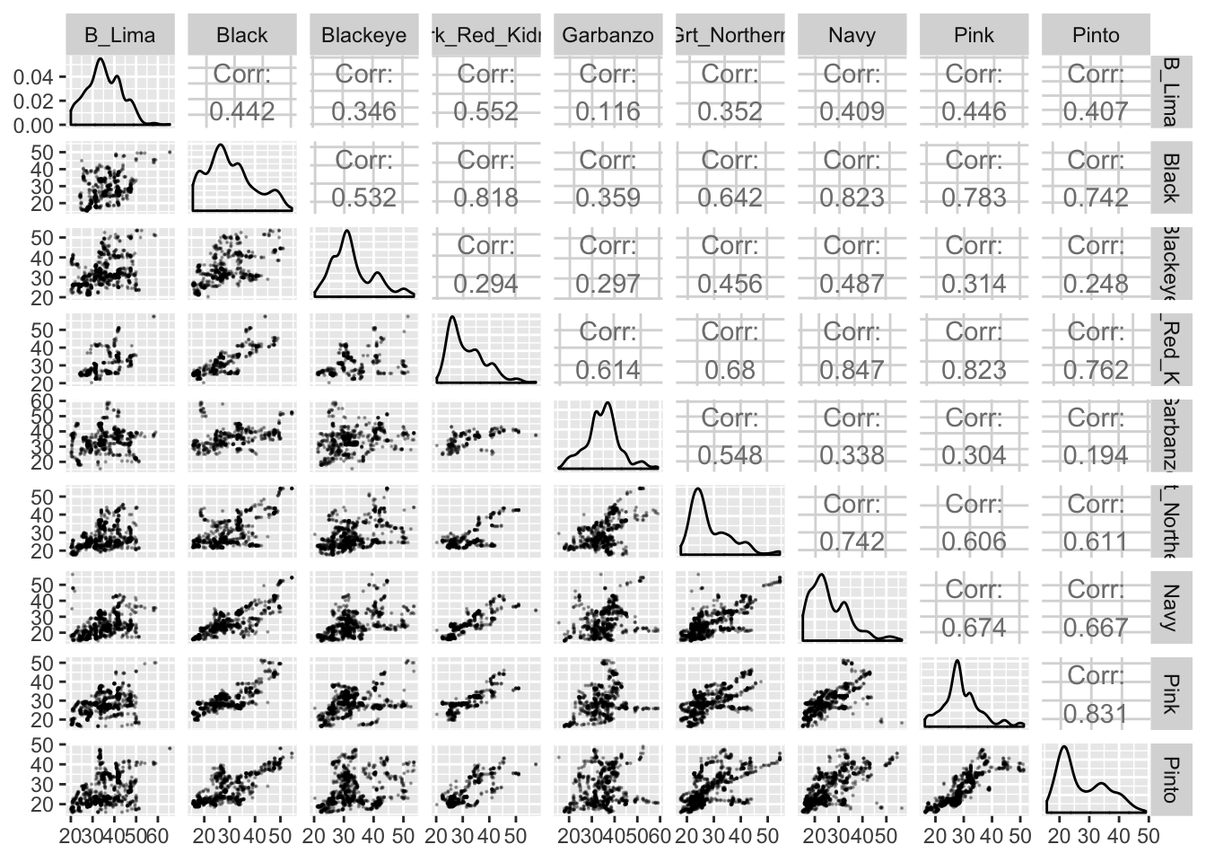 Lots of information here! We’ve plotted all combination of prices of different classes against each other, and the top-right of the matrix has the correlation coefficient for each combination. A correlation coefficient ranges from -1 to 1, where -1 and 1 are perfect negative and positive correlations, respectively.
A few interesting patterns to note:
- There aren’t any negative correlations - i.e. there are situations where the value of one varietal is high which is correlated with a low value in another varietal, which indicates there isn’t a lot of competition among varietals.
- Some varietals are very tightly correlated (i.e. Navy Beans and Black Beans, Dark Red Kidneys and Black Beans and Pinks and Pintos). I don’t have a good explanation for why this is - it would take some deeper insider knowledge of how the markets operate.
Conclusions
Overall, I hope this post demonstrated some of the interesting types of analysis that can be done on rich data sets like this. We performed basically no statistics on these data, but from some visualizations and summarizing functions, we can gain some interesting insights into historical trends in the market, and come up with some ideas about the type of forces driving these patterns.
Cheers!

